How to make responsive website with Elementor
Do you want to make a responsive website with Elementor?
Nowadays most users are accessing the internet with mobile devices. So if your website is not compatible with the small screen ratio then you are going to lose a huge number of users. Elementor has its default responsive option so using Elementor you can easily make your website responsive. So here in this article, you are going to show you how to make your website responsive with Elementor.
What is a responsive website?
For websites, responsive means that the website can work and display properly in different screen ratios. It doesn’t mean that website should display the same for every device but instead it will adapt the device screen ratios and display the content properly according to that device screen.
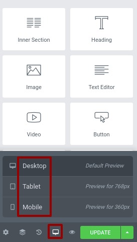
Using the Elementor responsive design you can be resizing all the elements of your website so that it can adapt the user’s screen and fit the content. There are their types of screen ratios you can resizing with Elementor without compromising the quality. The devices are-
- Desktop
- Tablet (768px)
- Mobile (360px)
You can see our article to learn how to make a responsive page using a pre-built template on Elementor.
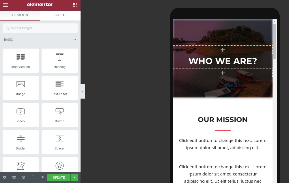
How to view different screens on Elementor
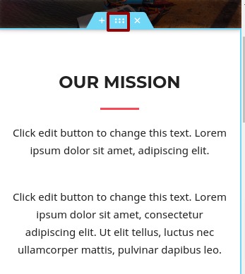
At first open a page you want to resize and rearranging elements for a responsive website. Open it on Elementor and from the bottom of the left dashboard you will be able to see the responsive mode option. Click on it and three device options show up the desktop, mobile, and tablet. Just click on the mobile to see the mobile view. To see the tablet view click on the tablet option.
The desktop view is the default view but when you click on the other device view you can see how your page will look on that device. The best of Elementor responsive features is that when you style your website on a mobile device it will not affect the tablet or desktop layout. The same things apply to the other devices too. So you can easily work with the different layouts without affecting other layouts.
Which elements need to be adjusted?
When you create a website based on a proper responsive theme then most of the elements are automatically adjusted with the different screen ratios. But sometimes you need to adjust it manually based on your content. Here you will show you how to adjust elements to make your website more responsive.
Fonts
Fonts are very important to any website as the users need to read them to understand your website. If the fonts are not displaying properly it will not possible for your users to read them. So you lost the users as well as it will affect the SEO. So you can not ignore the fonts to make them readable for every device available.
Your fonts may look perfect for mobile devices but for the smaller screen they may not be perfect. you can easily be fixed that by selecting the layout. To do that at first select the layout for example you are going to resize the font for mobile devices. So select mobile from responsive mode and then click on the text and you can see the text option in the left dashboard. You can set the size and alignment from here.
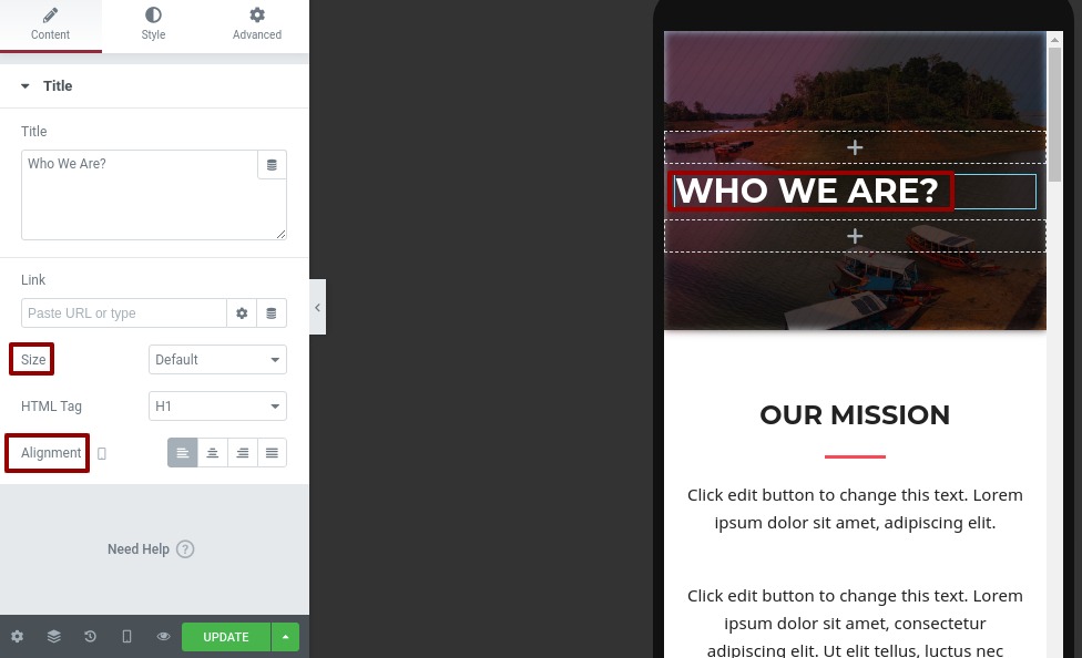
Now click on the style tab and you can see the font style there. From the typography option, you can change the font family, size, line height everything about the fonts.
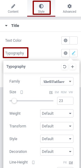
But you need to consider that some of the changes will affect other devices too. So the text needs to be adjusted in proportion.
Padding and margin
Padding is the space between the content and edge of the elements on the other hand margin is the space between elements. You can easily adjust the padding and margin of any section for different devices. Just click on any section and go to the advance tab from the left dashboard.
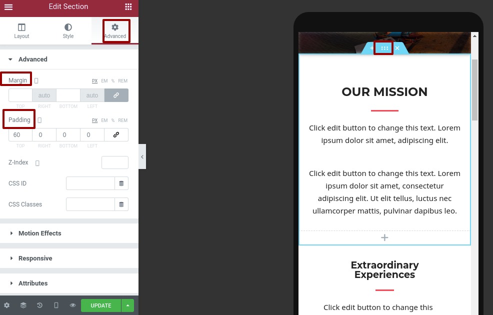
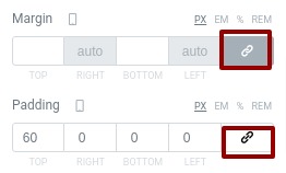
Here you can add padding and margin for left, right, top and bottom. The linked option from the right will add the value for the four options. Unchecked it to add value separately.
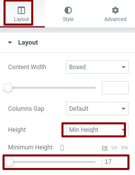
Raw height
Raw height is very important for websites that can be adjustable using Elementor for different devices. To adjust the row height at first select the section and click on the edit option.
Now from the layout tab, you can set the minimum height for different devices.
Enable or disable section.
Another important feature of Elementor is that you can hide a specific section for any specific device. For example, you have a section for the desktop device but you can disable the section for mobile devices and make a new section for mobile devices too. So the desktop section will shoe the desktop section and the mobile device will only show the mobile section.
To do this select any section then go to the advance tab and then click on the responsive option. From there you can hie this section for mobile devices and create e new section for mobile devices and hide your newly created section for desktop devices.
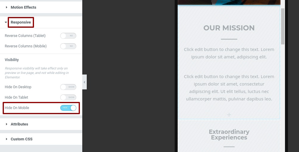
This will show you the mobile section on mobile and the desktop section on desktop devices.
Wrapping up
That’s it applying this process you can easily make your website responsive for all the devices. You can easily do it with Elemento responsive features.
We hope this article will help you to make the website responsive with Elementor. If you like this article please like our Facebook page to stay connected.


Comments