
How to use advance accordion with Elementor
Do you want to create advance accordion with Elementor in your WordPress website? Here in this article, we will guide you to add an advance accordion section using the Elementor page builder.
The accordion section will help you to display more information in less space. It is used to display text in a collapsed, condensed manner, letting you save space while still presenting an abundance of content. Elementor has its own Accordion widget which you can add to your pages. But if you want more layout with advanced features and functionalities you can use the Absolute Addons plugin, one of the best Elementor addons.
Use advance accordion with Elementor
To use our Advance Accordion widgets, first, create a section by clicking on the “+” icon on Elementor and then from the block section of the left bar search for Advance Accordion. Drag the Advance Accordion block and drop it into your created section.
 Now under the Content tab, you can select the Accordion style from the Advance Accordion Style dropdown menu. There are thirteen unique and professional-looking styles available for the Advance Accordion section. You can choose any of the styles you want.
You can see all the Advance Accordion-style from here –
Choose any of the styles you want by clicking on the style number.
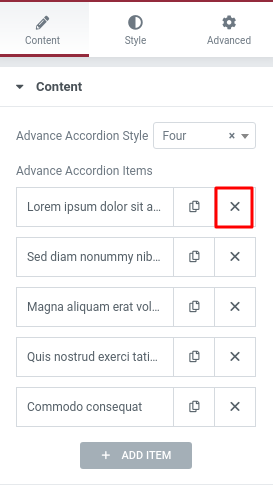
After selecting your style now it’s time to edit it. By default, your accordion will have five items. You can delete any item by clicking on the “X” icon.
 You can also duplicate any item just by clicking the icon next to the delete icon. To edit any item just click on the item and you can see the title edit and paragraph edit option. Add your title in the Accordion Title field and add text in the Accordion content area.
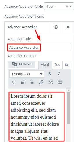
You can add items by clicking on the Add item button. Just click on it and an item will be added and you can edit the title and content following the same procedure.
Now go to the Accordion Control tab and here you will find some more advanced options. You can enable or disable the Accordion icon from the Select accordion icon menu. If you select yes your accordion will enable, selecting no will disable the icon. Here you select option no from the select accordion icon menu and you can see that the icon will disable from the design.
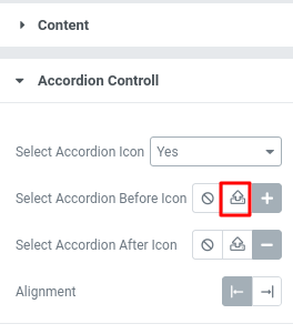
But if you select yes from the select accordion icon menu then you can see two more options –
- Select accordion before icon: You can select the icon before expanding the accordion.
- Select accordion after icon: You can select icon after expanding the accordion.
To select an icon you have two options. You can upload your own icon in SVG format or you can choose any icon from the icon gallery. To upload your own icon click on the Upload SVG option and you can select your icon from your computer.

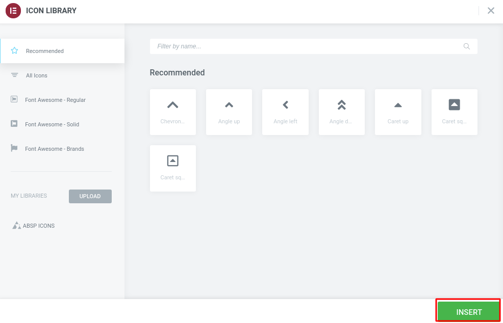
To add accordion before the icon from the icon library click on the Icon library option and it will pop up the Elementor default icon library page. Just select the icon you want to add and then click on the Insert button. Follow the same procedure to add accordion after icon.
From the Alignment option, you can set the icon potion, you can add the icon at the start of the accordion or end of the accordion. This is how it looks when you select the alignment to End.

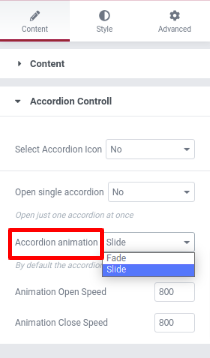
You can select the accordion animation effect from the Select animation tab. There are two animation effects available
- Slide
- Fade
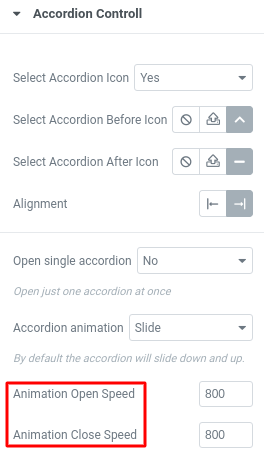
From the animation open speed and animation close speed, you can set the animation speed while opening and closing.
Now move on to the Style tab where you can style your accordion as you want. In the style tab, you will find 4 different menus and under those menus, you will find all the features to redesign your accordion in a minute.
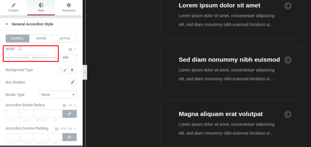
Under General Accordion Style you can style your accordion for three different conditions:
- Normal
- Hover
- Active
For normal mode, you can set the width of the accordion from the width option.
You can set the background of your Accordion from the Background Type option.
- Classic – You can set the background image
- Gradient – You can add color gradient
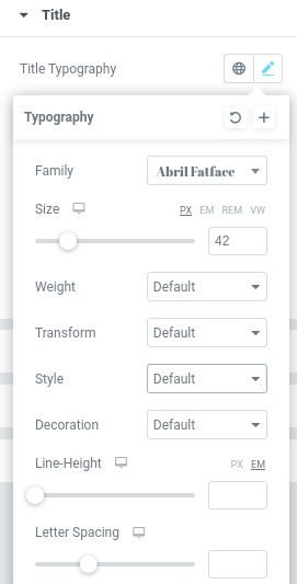
Now come to the title option to style your title text. You can style the title for normal, hover and active conditions. In title typography you have two options, you can add custom typography or you can set your title from the style options. Click on the edit option and the style page pop up where you can set the font family, font size, width, line height, and text transform.
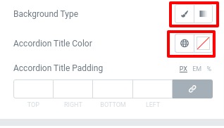
Set background as classic or gradient from the background type option. You can also add title color and padding to place the title in the right position.
Style the hover and active condition following the same way.
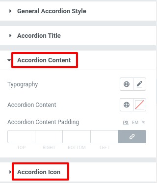
From the Accordion content menu you can style the content area and using the Accordion icon menu you can style the icon area for normal and hover situations.
That’s it! Your advance accordion section is ready.
Wrapping up
Following the process, you will be able to add an advance accordion section to your website. You can see our other article to learn How to create a multicolor heading with Elementor
How to add an image slider using Elementor free
How to Create a Gradient Button in Elementor
We hope this article will help you. If you like this article please like our Facebook page to stay connected.



Comments